H. B. Fuller
A full-implementation web solution that connects what matters between H. B. Fuller and their customers.
Project: HBFuller.com
H. B. Fuller’s new strategic direction was to create a more intuitive, persona-centric experience through responsive design. With an extensive array of products, H. B. Fuller needed a common sense taxonomy which was not only user-friendly but scalable as they manage their products at both a global and regional level.
Challenges
- Give the user a better idea of the company’s products and capabilities
- Create a site structure that allows multiple paths to products
- Work on any device, at any resolution
- Provide a design and structure that supports globalization and translation
- Support and enhance their new brand direction
My Role
UX Architect, UX Designer, and Web Strategist, conducting stakeholder interviews, producing high-fidelity wireframes, UI/Design, long-range planning and user testing
Information Architecture
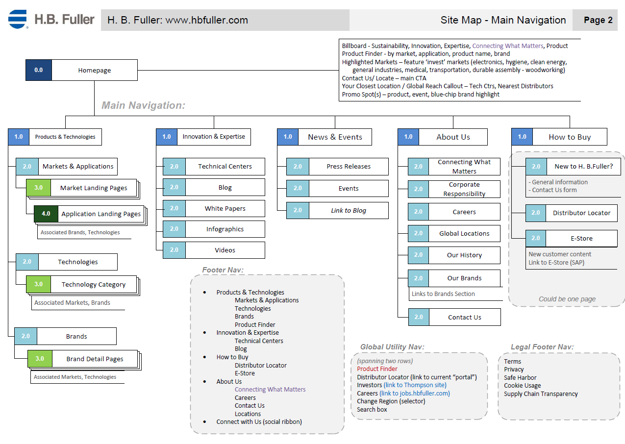
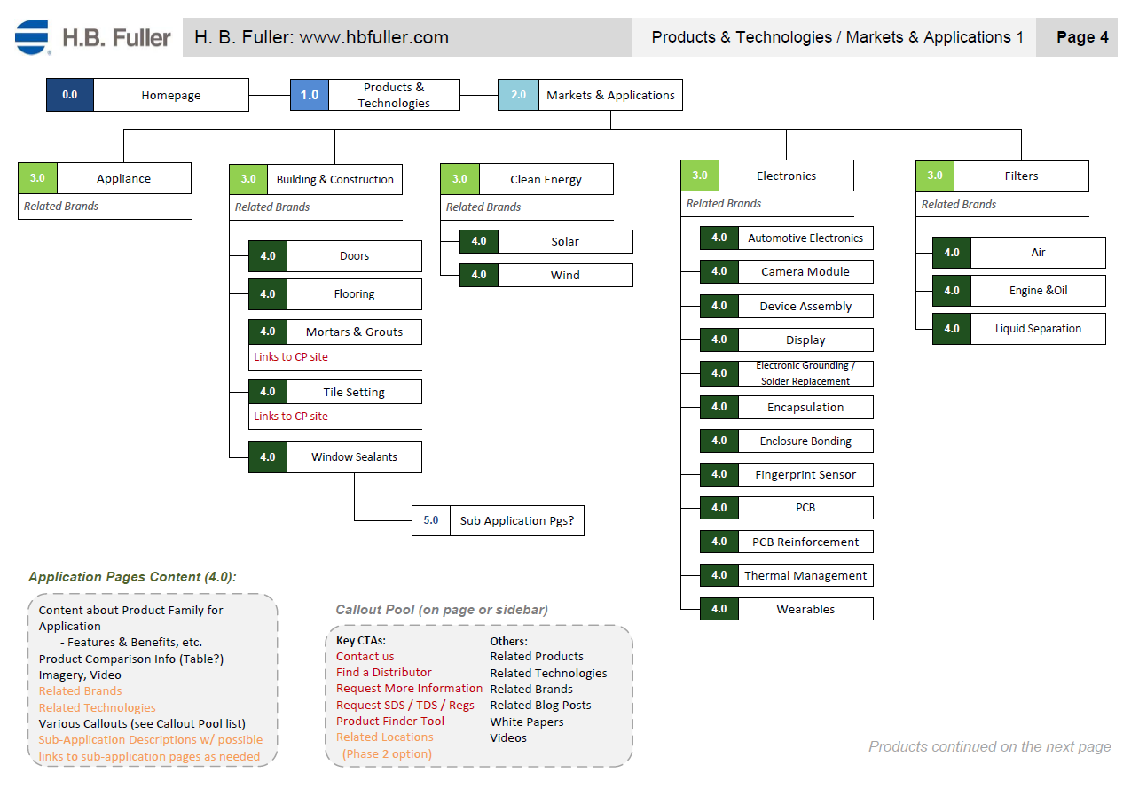
H. B. Fuller offers thousands of adhesive products and technologies that are useful for unlimited applications across dozens of target markets, so we needed to create a site structure that could allow users to search by all of those parameters, as well as understand applications for their products that most users haven’t even thought of. Most importantly, the structure needed to support globalization and translation across the global market. The result was a 39-page IA document that detailed the multiple methods of navigation and ensured easy translation.
Tools
Stakeholder Interviews, Visio
Features & Solutions
- Products are categorized by market, applications, technology, and brand
- We offer an entire section dedicated to their innovation, as thought leadership was an important factor for market differentiation
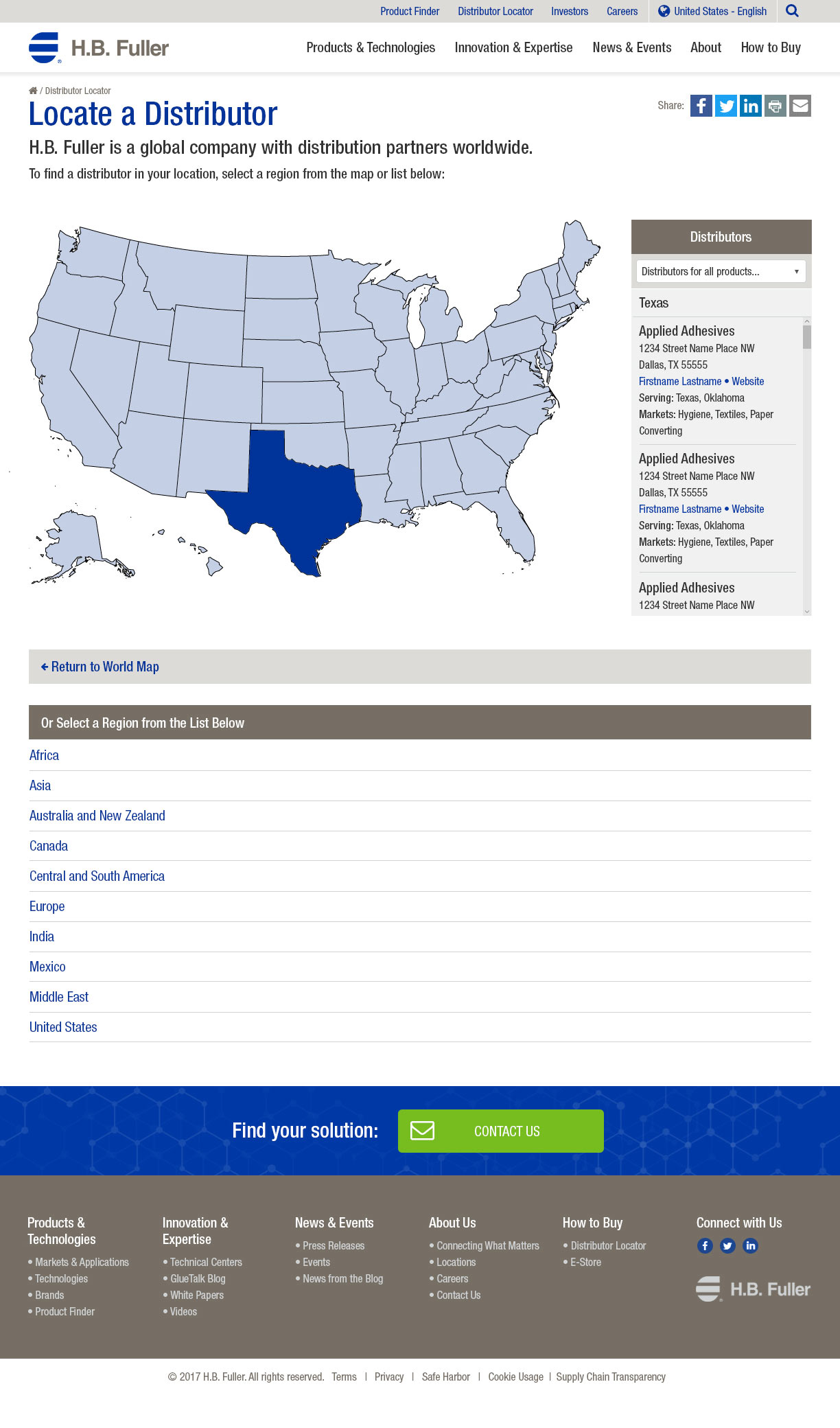
- Important functionality, such as product finder, distributor locator, and advanced search are introduced
Wireframes
Based on our stakeholder interviews, discovery sessions, and information architecture, we created wireframes in three resolutions for all identified page types. One major goal was to help a user understand all the different applications for which H. B. Fuller products can be used, so we devised an interactive billboard that shows specific adhesive products in every day use, rotating between different application environments. We focused the homepage on education around markets and applications, while preparing the layout for future personalization.
Tools
Axure Pro
Features & Solutions
- Prominent search for users who know what they are looking for
- Fully content-manageable rotating billboard to highlight everyday uses for their products
- Prominent placement for main calls-to-action and engagement points on all pages
- Highlighted thought leadership articles to promote their innovation
- High-fidelity wireframes included functional tools like distributor locators and product finders with advanced search and filtering
- Conceptualized to support future personalization of content like billboards, featured markets, thought pieces, and more
Designs
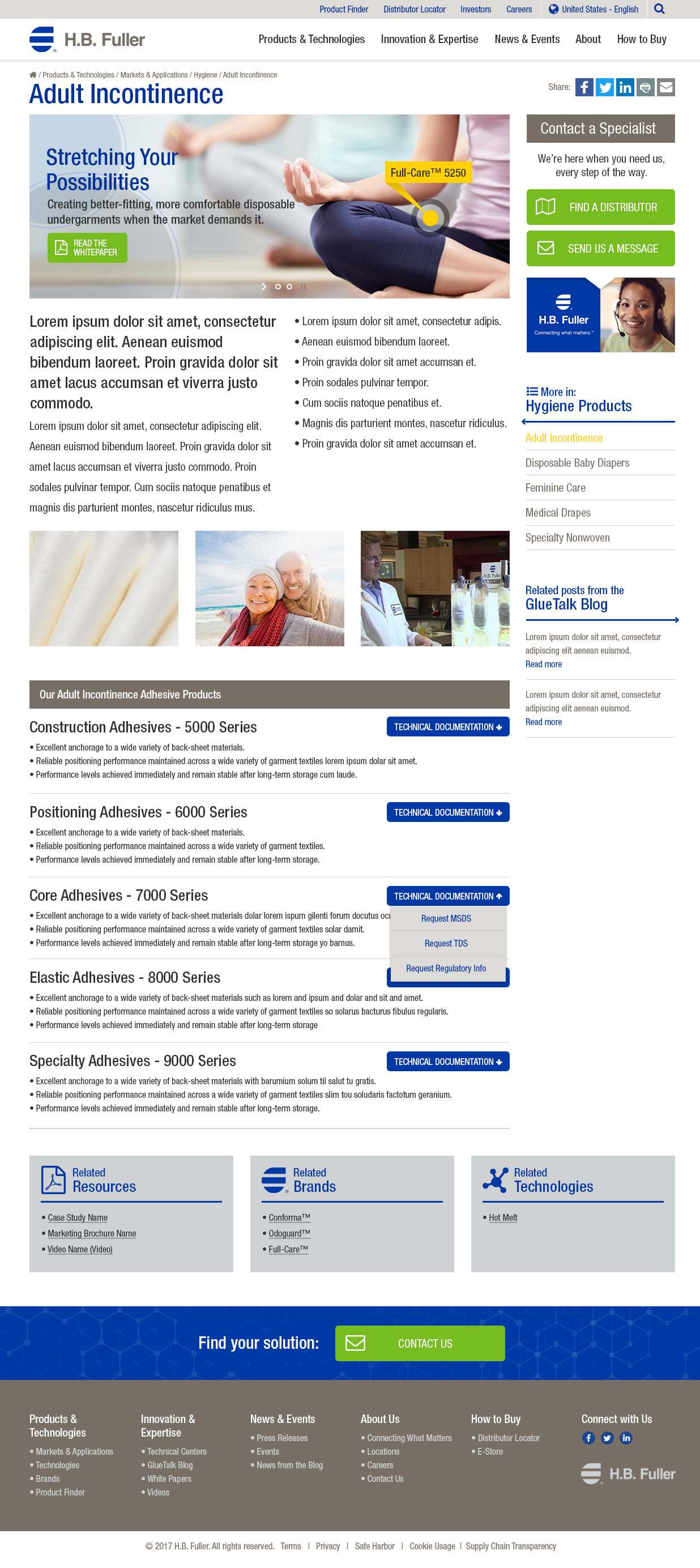
After the wireframes were approved, we created the designs for the visual UI for all page types in three resolutions, making sure to use the client’s documented guidelines and standards to support and enhance their brand.
Tools
Adobe Photoshop
Features & Solutions
- Dedicated action color helps draw attention to the most important calls-to-action on the page
- Color strategy and page layout support easy scannability
- Design is optimized to accommodate globalization and easy translation of content
- Locator tools use SVG technology to display distributors, technology centers, and more
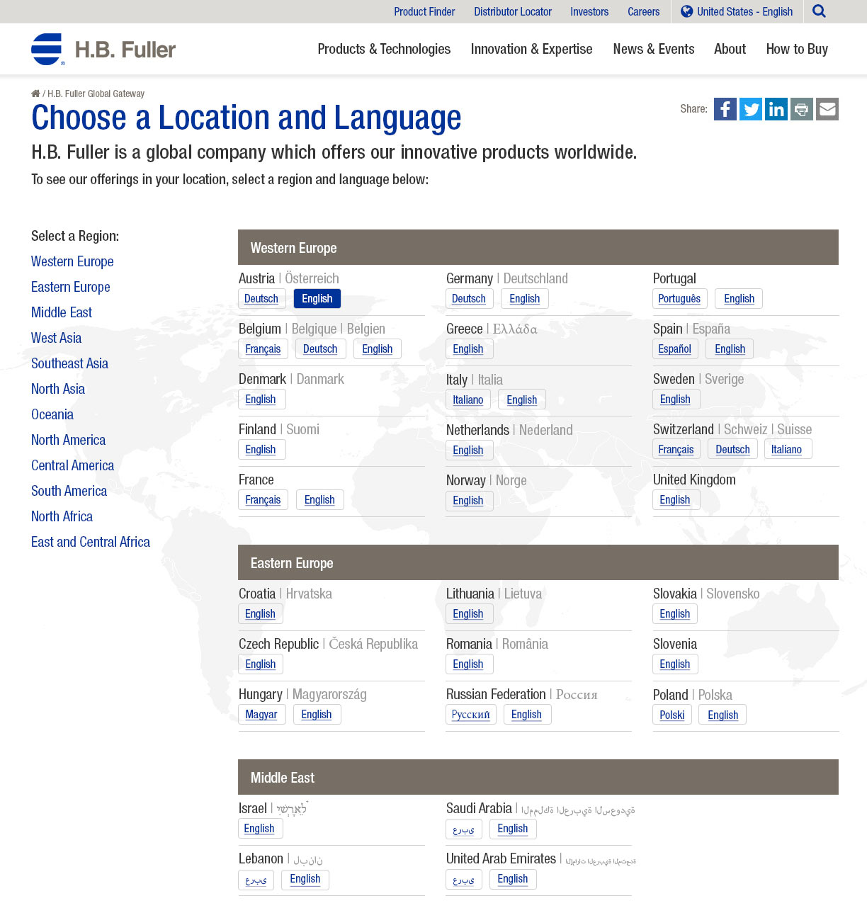
- A newly-designed global gateway utilizes best practices to offer translated versions of the sites in multiple languages across dozens of regions
- The newly conceived Product Finder allows for easy filtering to find important product information like MSDS sheets and regulatory information
The Results
As you can see in the original site shown here, the new site improves the user experience by promoting applications and thought leadership in a clean, straight-forward, easy-to-navigate layout. It tells their story with a new, modern, responsive site that is built to scale with the organization’s goals for translation and personalization. You can search for products by market, brand technology, or keyword in the new robust product finder. Internal efficiencies have been gained as they can easily increase the number of translated languages. H. B. Fuller is now able to connect what matters to their customer.


