Boston Medical
Explaining complicated health insurance plans to casual users can be a daunting task, but with some careful planning you can guide your users to the right choice.
Project: BMCHP.org
Boston Medical offers government-assisted healthcare plans for qualified individuals, but that makes the qualification and enrollment process complicated. So they needed a clear website to hold users hands as they make their way from application to membership.
Challenges
- Present the complicated qualification and enrollment process in way that sounds simpler than it actually is
- Offer easy access to resources and locator tools for existing and new members
- Offer additional information for providers and care facilities for accessing policy details and information
- Represent the region through relevant imagery, and enhance the brand with consistent standards
My Role
Creative Director, UX Architect, and UX Designer, conducting stakeholder interviews, producing an information architecture, high-fidelity wireframes, and UI/Design
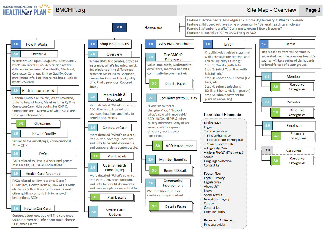
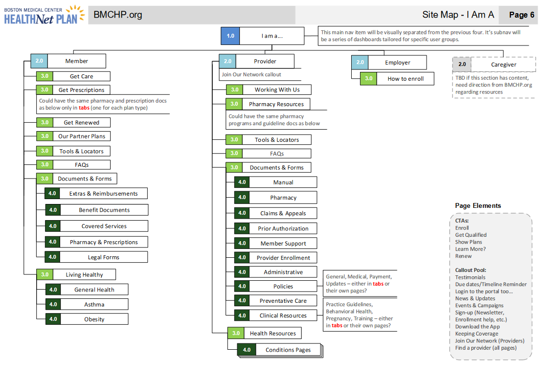
Information Architecture
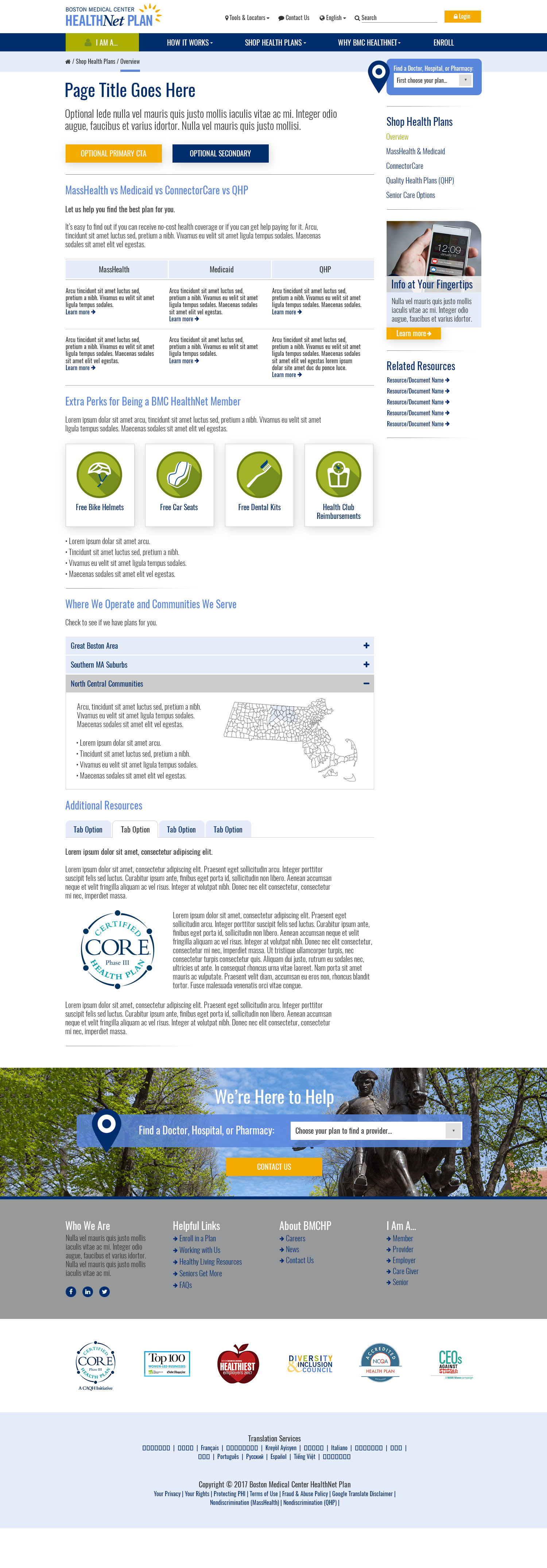
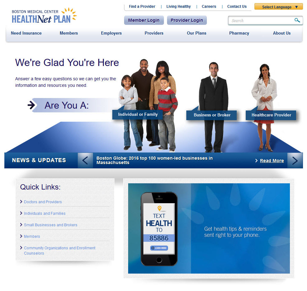
Structuring the site was a challenge because it couldn’t follow typical navigational conventions, so we focused the main navigation toward the insurance “shopper” persona, whose tasks were determined to be the most difficult yet important. The remaining personas, like members and providers – who are mostly concerned with locator tools and resources according to our interviews and research – are handled through an “I am a…” identification dropdown that guides users toward dedicated dashboards that are tailored for their specific needs.
Tools
Stakeholder Interviews, Visio
Features & Solutions
- 19-page IA document fully details the complete structure of the site and indicates the recommended layout at the page level
- Nomenclature carefully chosen to reflect their particular user base’s technical savvy and education level
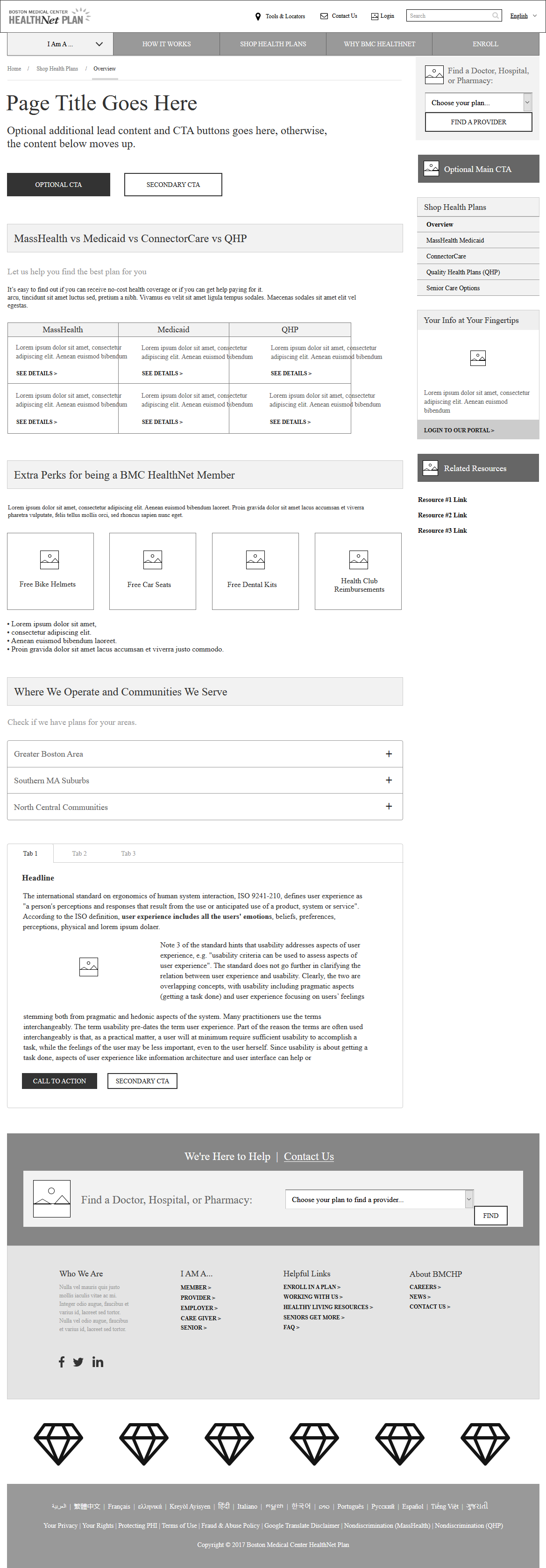
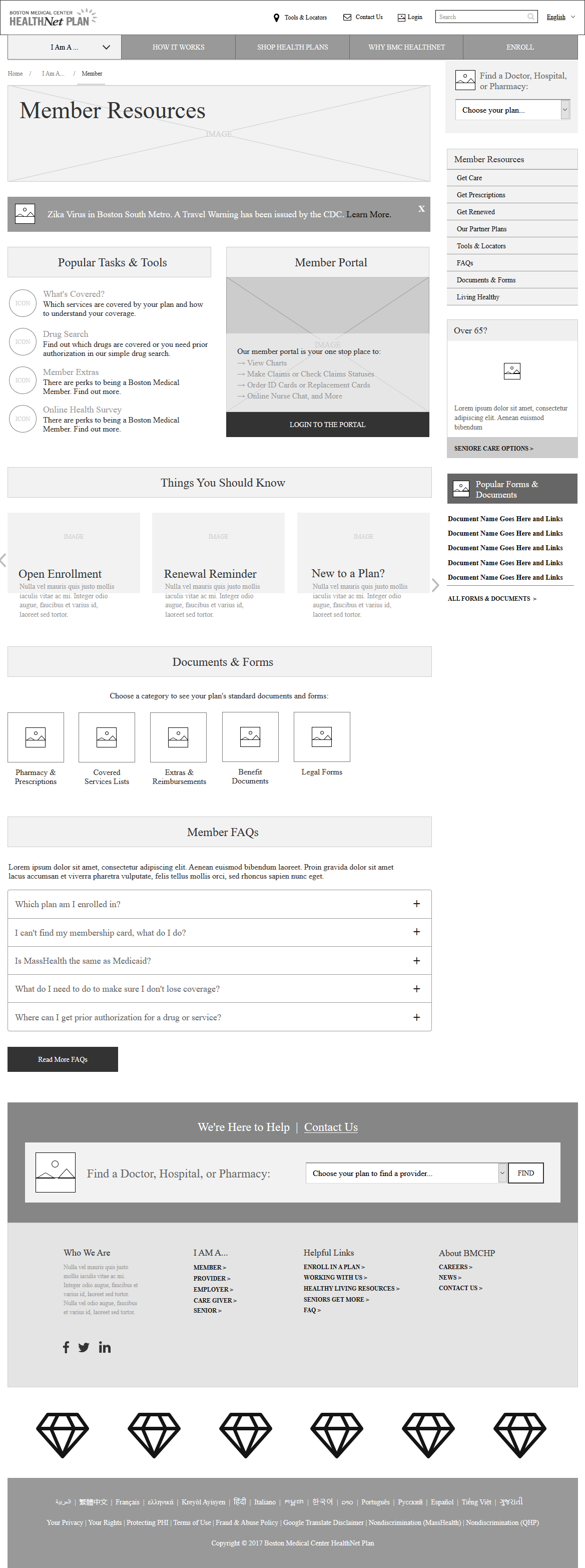
Wireframes
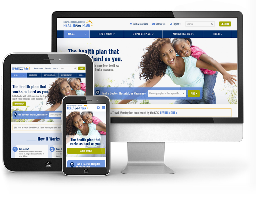
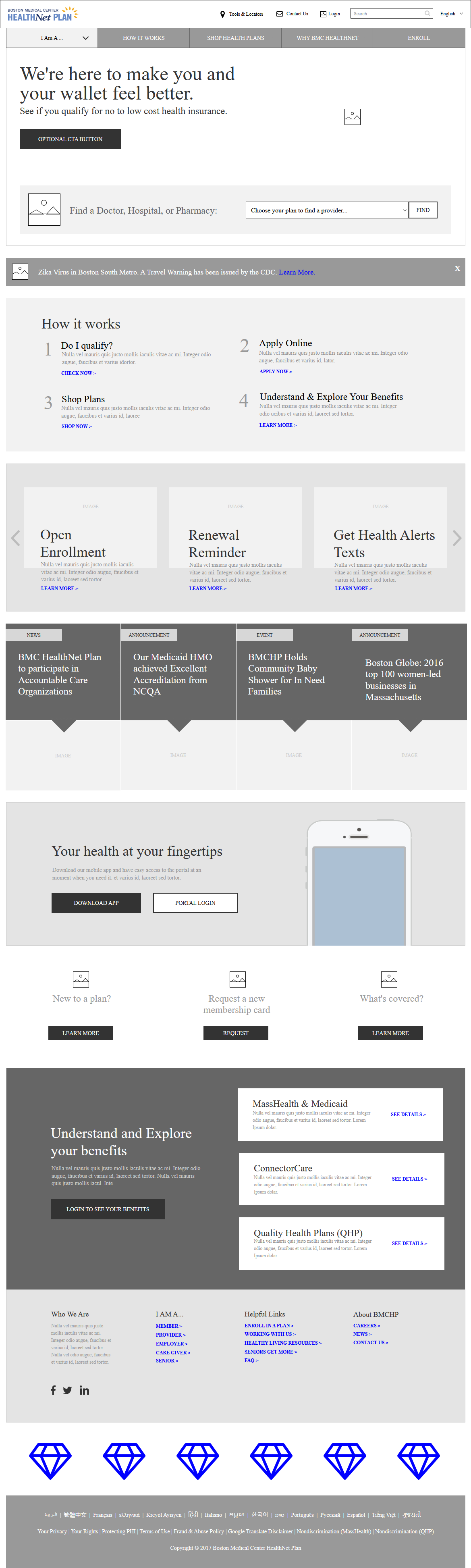
Fully responsive wireframes were then created for all identified page type, such as homepage, member dashboard, provider dashboard, plan details, etc.
Tools
Axure Pro
Features & Solutions
- Specialized navigation guides new users step by step
- Popular locator tools for current members are prominently displayed
- Optional areas for health-related alerts are proposed
- Multiple marketing components are available to appeal to the insurance “shopper” persona
- Features a variety of different display options for subpage content, like comparison tables, expanders, tabs, and more
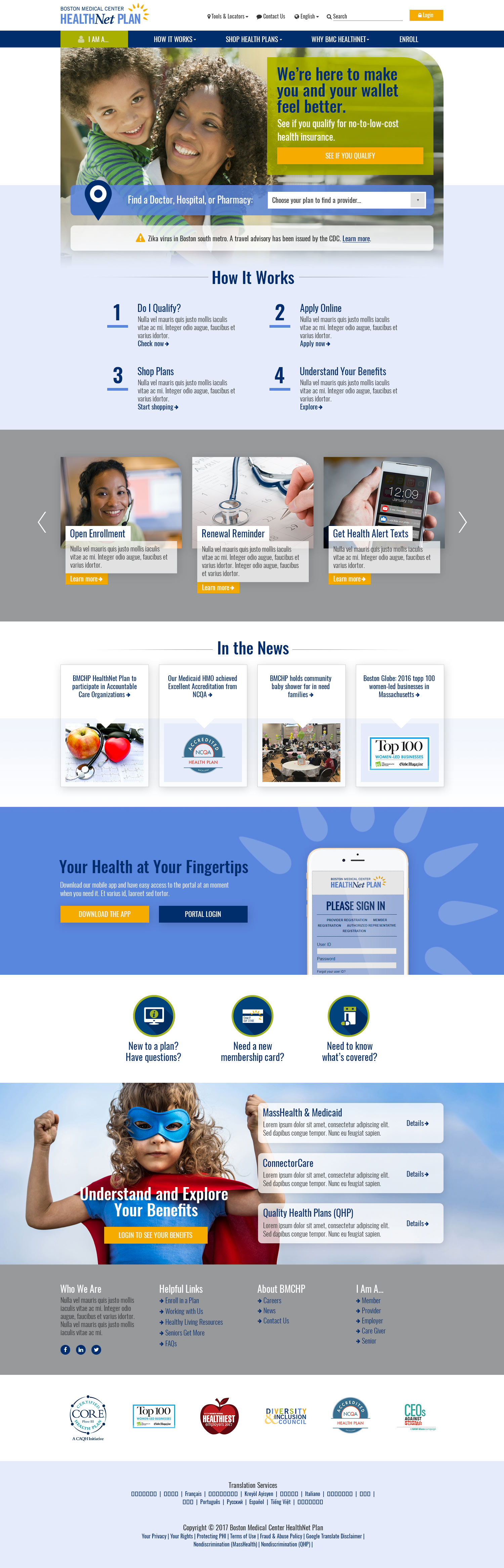
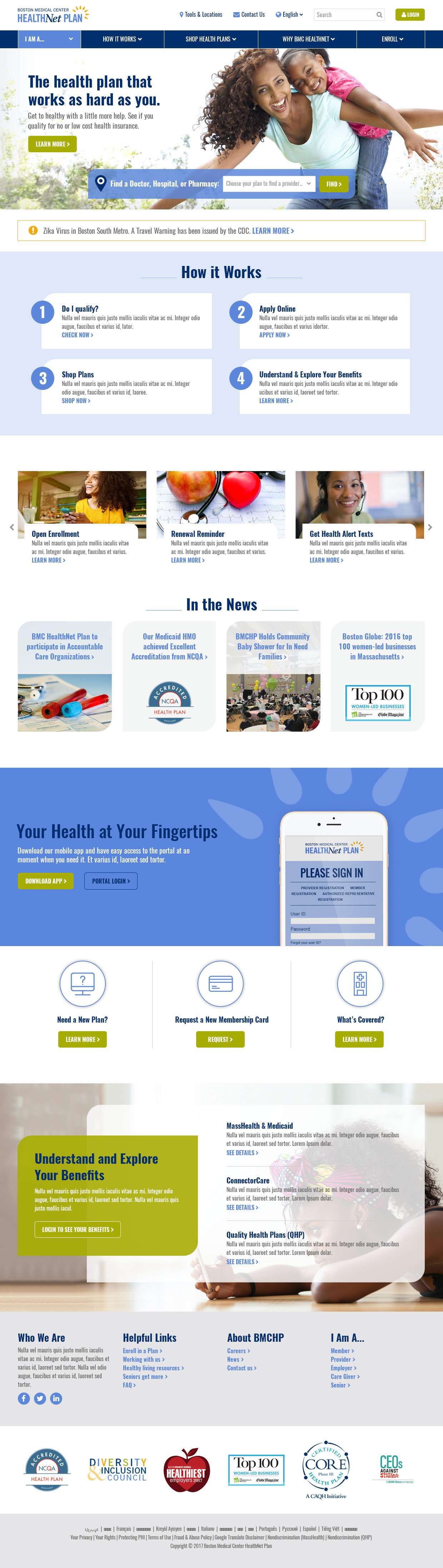
Designs
We applied two separate design options to the approved wireframes, which were eventually combined into a single finished layout for implementation.
Tools
Adobe Photoshop
Features & Solutions
- Imagery reflects the region and demographics where this insurance plan is available
- Design elements extend and enhance the Boston Medical brand, seamlessly integrating with their other web properties
- User interface is carefully curated to imply simplicity and ease-of-use combined with a friendly attitude
- Design and focused color strategy guides users toward points of engagement and primary objectives
- Front-end design and code were implemented to comply with AA-level WCAG accessibility requirements
The Results
The original site focused too heavily on all personas, forcing a user to self-identify on the homepage before seeing relevant content. Changing this convention by dedicating the main homepage and navigation to the “shopper” persona allowed us to focus on specific goals. Dedicated dashboards for other user types can be used as alternate homepages and campaign landing pages, giving everyone a tailored experience that can deliver the tools and resources that are most relevant to them.