Daytona International Speedway
Honoring the history of an iconic venue for racing and events through dynamic personalization and responsive design.
Project: DaytonaInternationalSpeedway.com – SPEC
Daytona International is so much more than a speedway. It’s a state-of-the-art event facility promoting arena concert experiences and rental spaces. But the history of the iconic venue is more important than ever, and they needed a re-envisioned website to reflect that and more.
Challenges
- Present DIS as more than just a speedway
- Highlight the venue’s premier event and historical significance
- Integrate social media and other community-driven elements
- Display complex data, like multiple even calendars and announcements, in a simplified interface
My Role
UX Architect and UX Designer, defining the user experience and creating a spec design for a sales opportunity
Wireframes
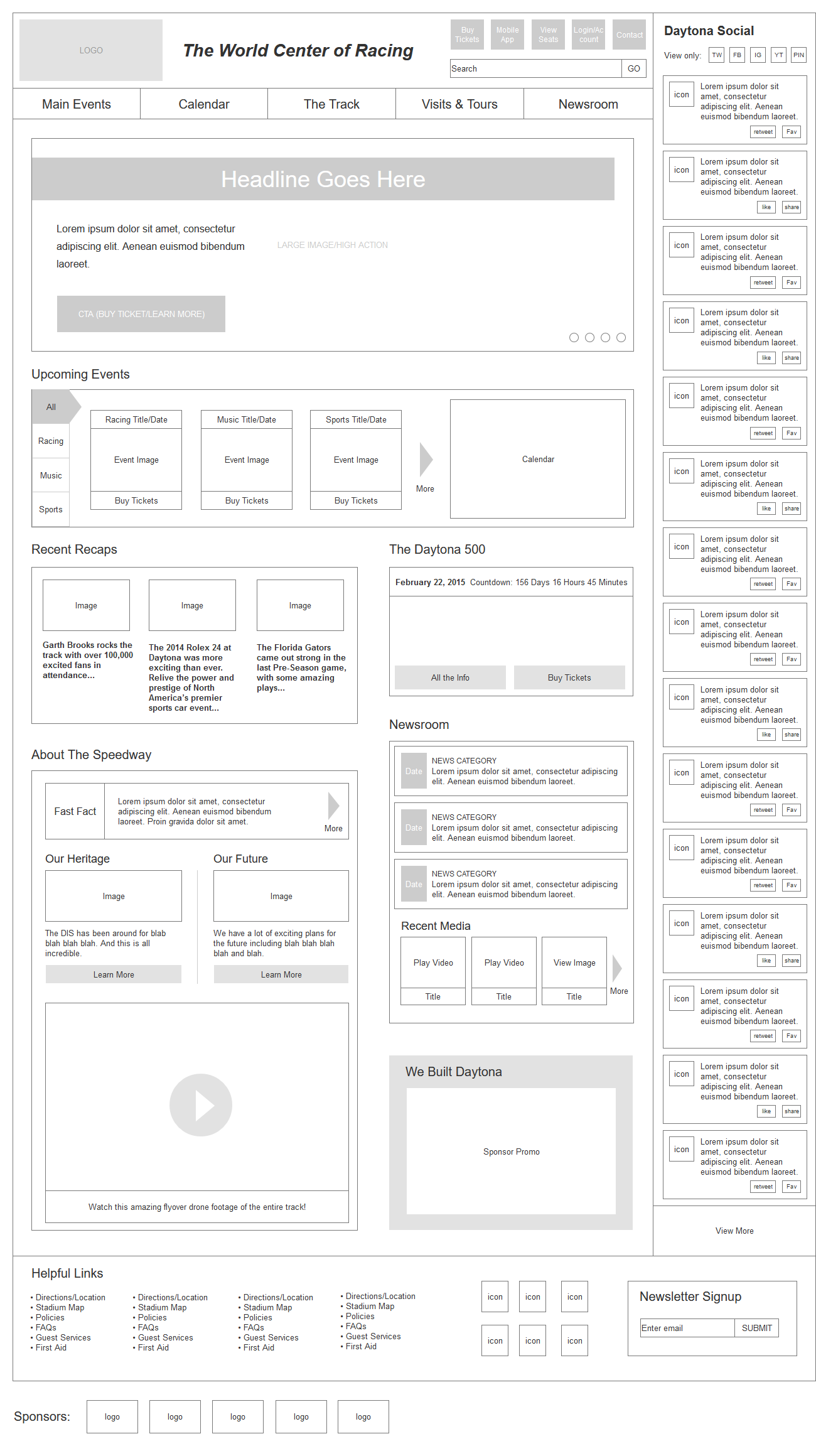
In order to get our heads around the sheer amount of content required for a homepage to achieve all of their goals, we created a wireframe that focused on clarity and convenience, with a straight-forward menu and clear points of engagement.
Tools
Axure Pro
Features & Solutions
- Planned for personalization from the start, with ample opportunity for content customization
- Intuitive calendar and event schedule that allows for segmentation
- Prominent social media integration including an aggregated feed that combines tweets, posts, videos, and more into one hyper-current component
- Dedicated areas for historical content, a Daytona 500 countdown, recent news, media posts, and more
Designs
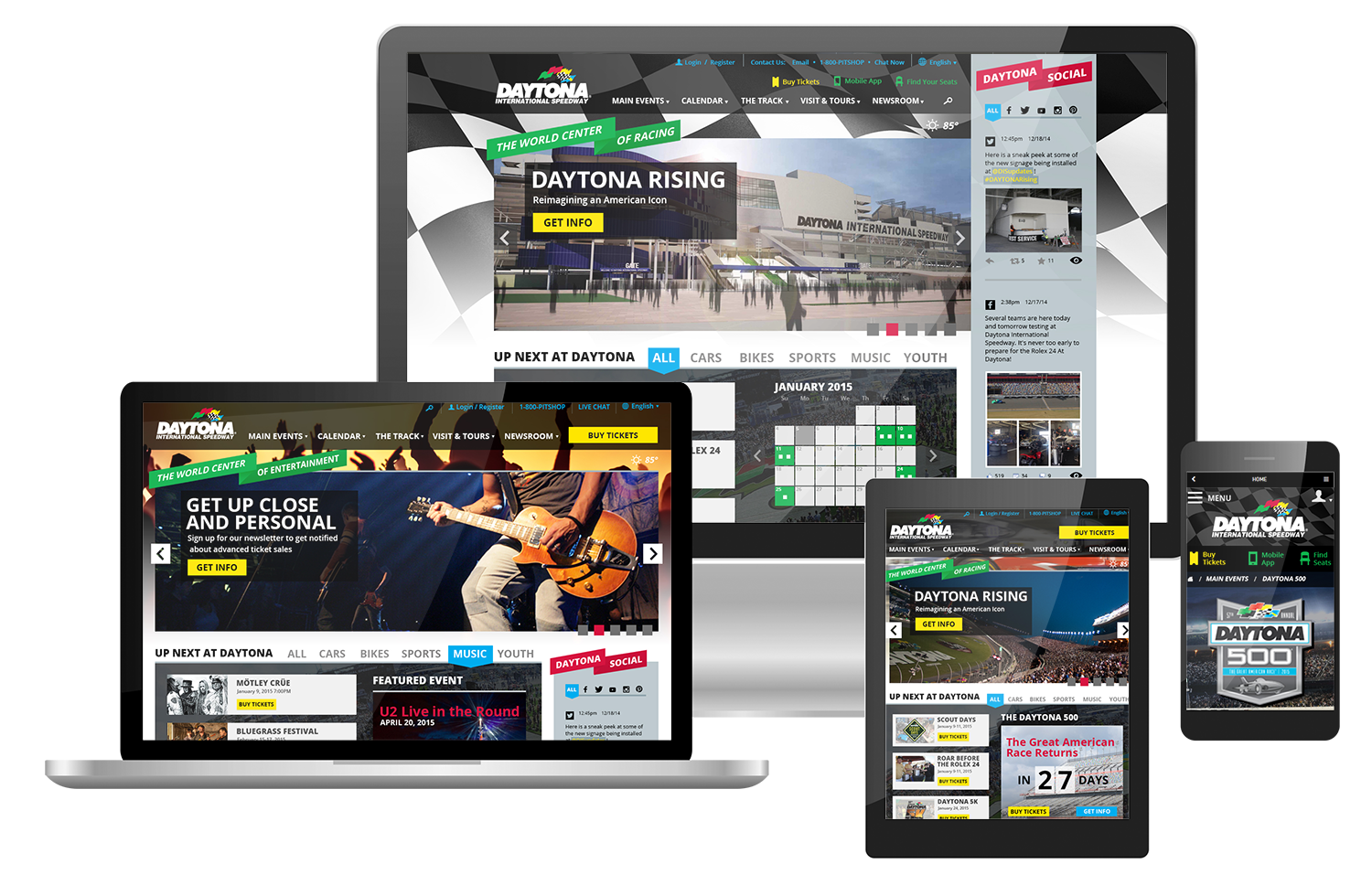
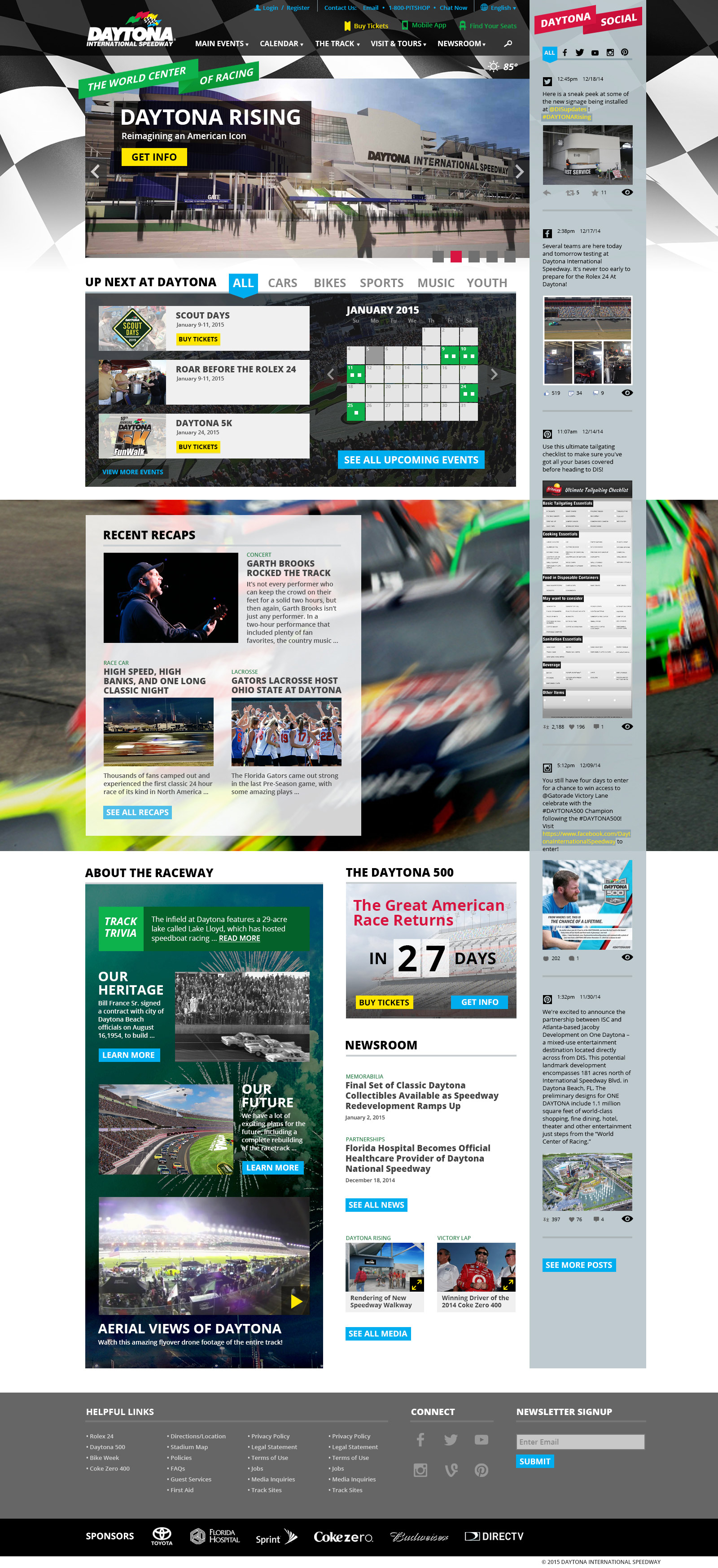
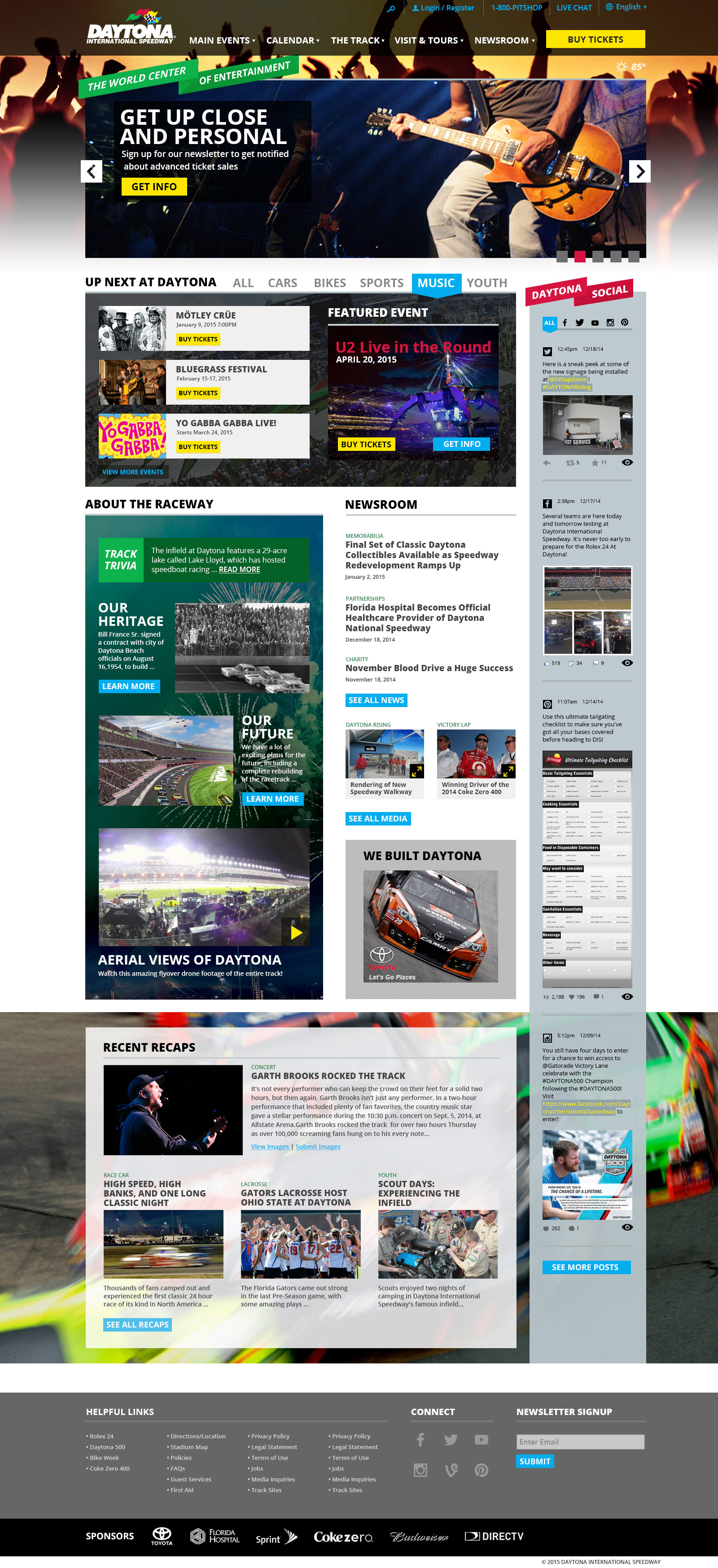
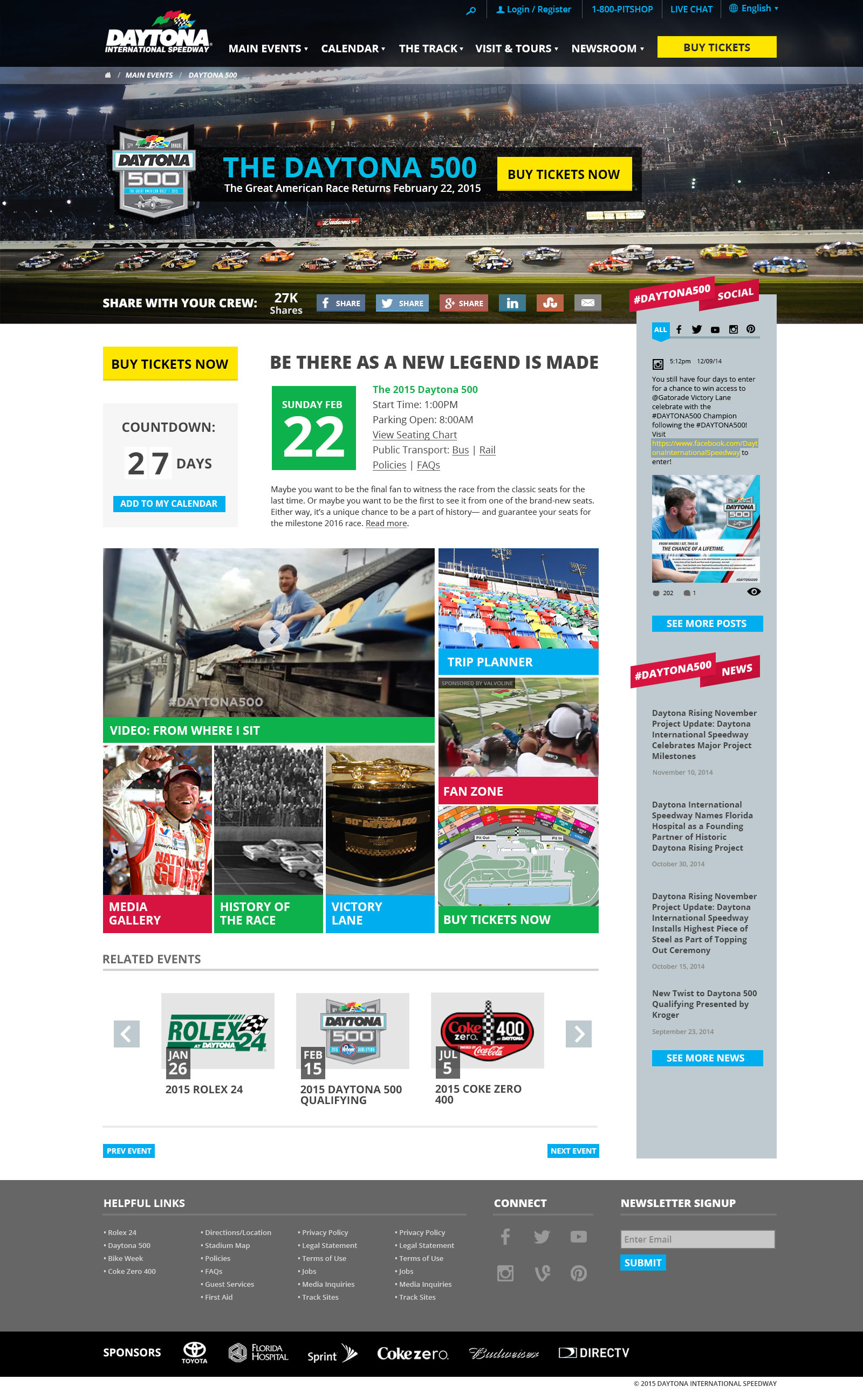
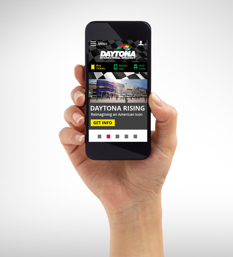
Pitching the concept of personalization as a means to achieve their goals, we created two homepages in three responsive resolutions to show both a raceway-focused homepage and an implicitly-personalized music-themed homepage. We also created a mock-up for an Event Details page to show how this design would lend itself to internal pages.
Tools
Adobe Photoshop
Features & Solutions
- Clearly defined visual areas and components to help organize the vast amount of content
- Complex color strategy makes it easy for the eye to scan for action elements and points of engagement
- Clear and concise interface that allows for an immediate birds-eye view of everything happening at the venue
- Optimized to break down for responsive resolutions without losing functionality or flow of content
- Background imagery and tab presets can be easily customized based on perceived audience


