INTA
The International Trademark Association was searching for an agency who could transform their association’s online presence into something more engaging and user friendly.
Project: INTA.org – SPEC
Just like any association, INTA’s goal were to attract new members and increase repeat visits from existing members by offering a more targeted experience and by highlighting their valuable assets and content.
Challenges
- Attract more new members
- Increase visits from current members and increase renewals
- Promote INTA as the thought leader in trademarks and copyrights
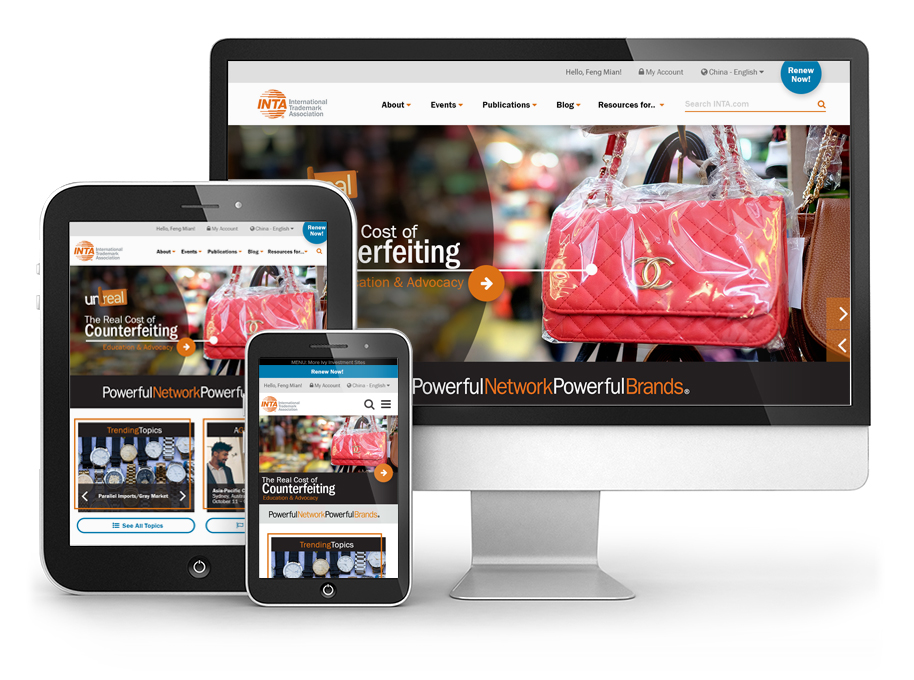
- Provide an optimal user experience at all resolutions and on all devices
- Provide ample opportunity for personalization
- Ensure the layout can accommodate translation
My Role
UX Architect and UX Designer, defining the user experience and creating a spec design for a sales opportunity
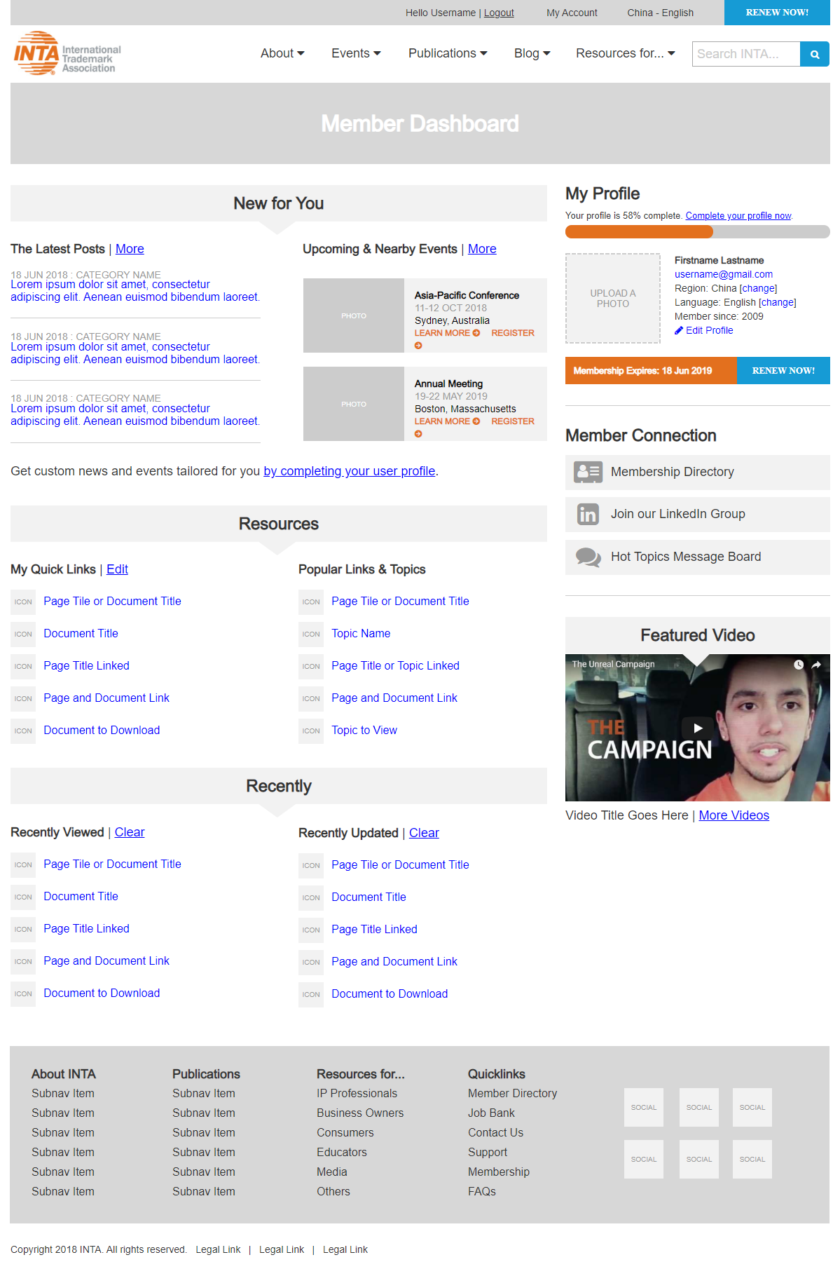
Wireframes
INTA’s current site was lacking any user dashboard, so we created an aspirational wireframe to demonstrate the goal of hyper-personlization for their members. We also created homepage wireframes so that we could create spec designs to show the benefits of an updated and responsive user experience.
Tools
Axure Pro
Features & Solutions
- A simplified navigation highlights both thought leadership items and resource libraries, organized by role
- User dashboard offers specific blog posts, resources, and events, curated by their role, their browsing habits, and their location
- Encourages participation and profile completion to fine-tune personalization tactics
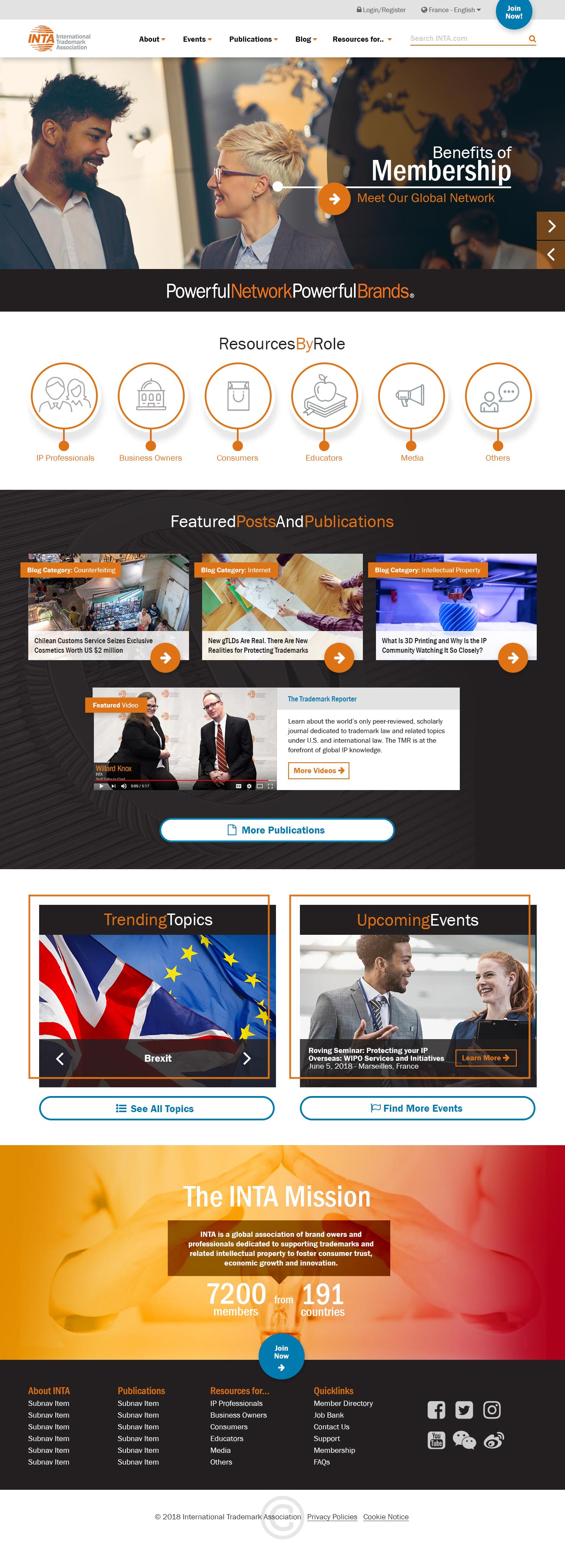
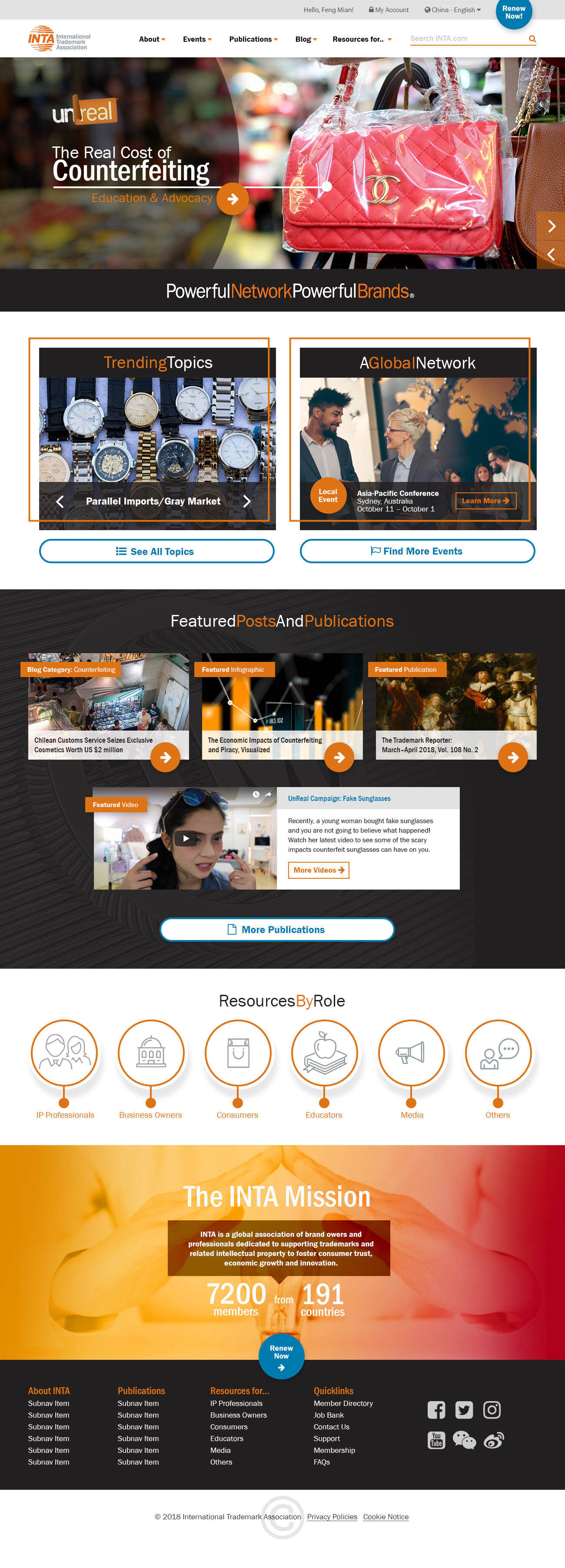
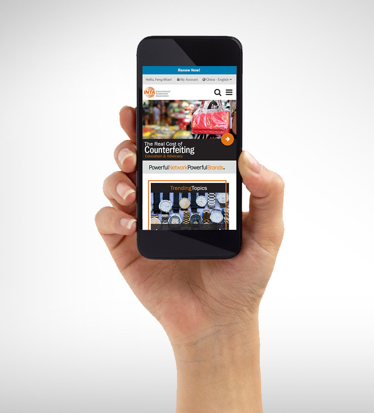
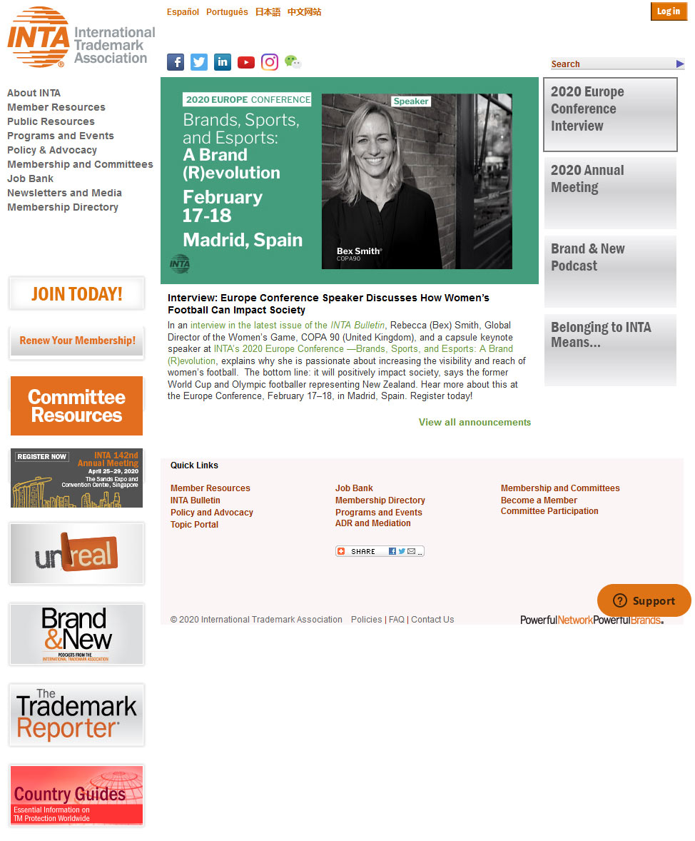
Designs
When it came to the designs, the goal was to create an easy to parse, componentized layout that offers ample opportunity for personalization and custom content for both members and non-members. We created the homepage design in two versions to show the different possibilities between what a member might see versus a non-member.
Tools
Adobe Photoshop
Features & Solutions
- Micro-personalization, like “Join Now” versus “Renew Now,” targets members or non-members with the proper call-to-action messaging
- Non-member version promotes the benefits of membership and prepares for implicit personalization by allowing a user to self-select their role or interest
- Logged-in version focuses on promoting content and topics that have been determined to be of interest to this particular user based on her profile or her past browsing experiences
- Both versions focus on promoting thought leadership and upcoming events that could be tailored to the user’s location, regardless of whether or not they are a member
- Focused color strategy and iconography enhances usability, encourages interaction
The Results
The original design was poorly organized with a complex navigational strategy that didn’t focus on promotion of thought leadership or membership benefits. The site was not optimized for mobile devices or varying resolutions, and it did not adhere to any accessibility standards.
The new version presents the content in a clear and concise format, with intuitive navigation, and targeted content – ready for translation and localization.