JBT Corporation
One corporation with three divergent businesses needed one unified presence.
Project: JBTC.com
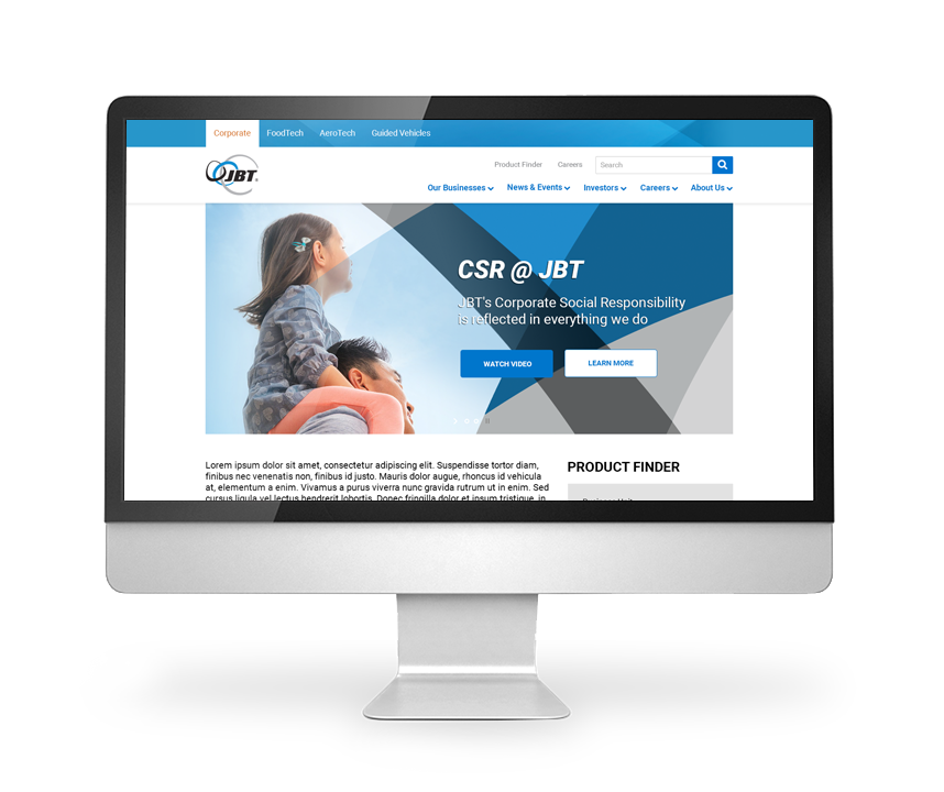
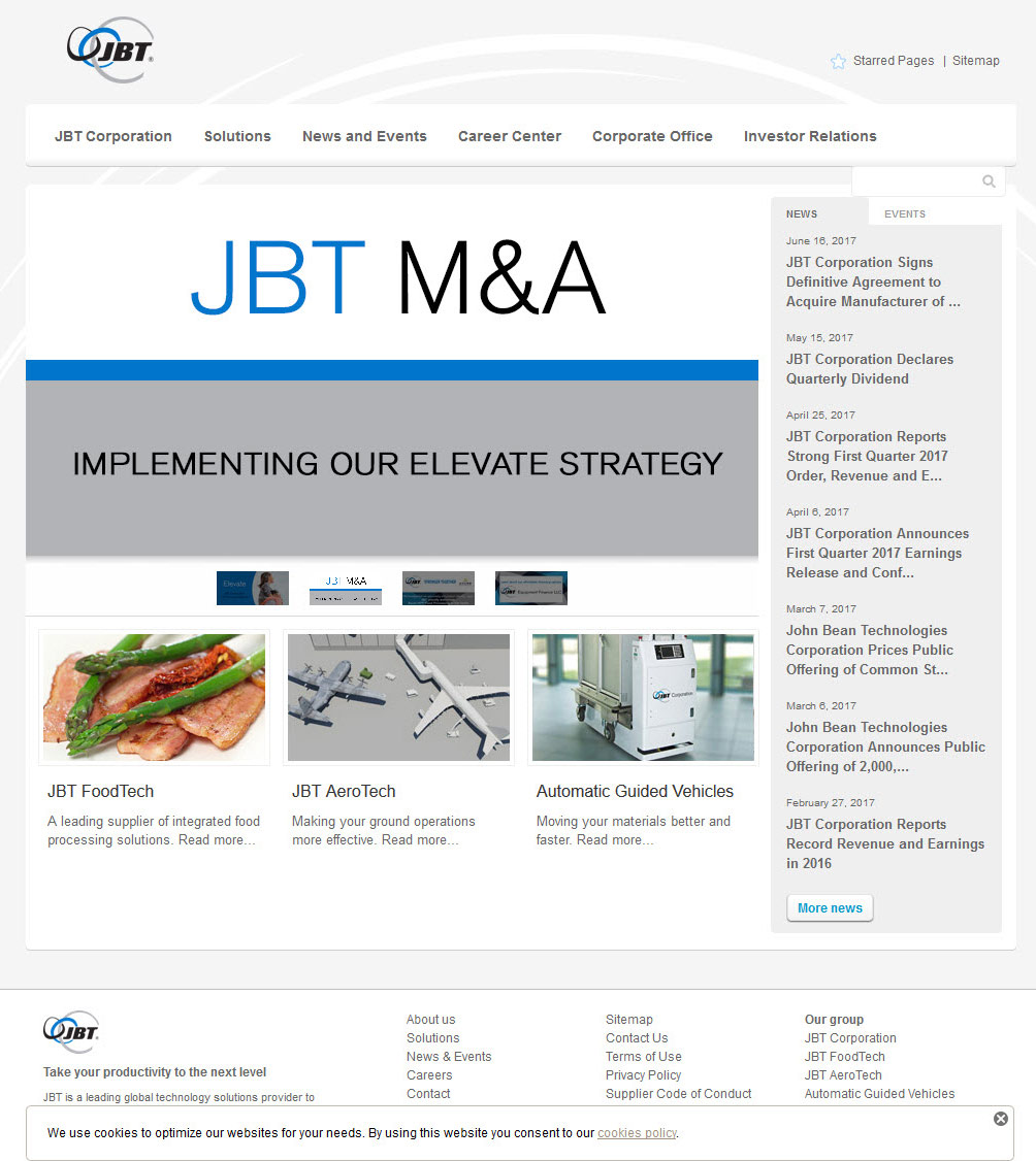
JBT is comprised of three vastly different divisions, but their new corporate strategy was to promote themselves as one cohesive company. This meant creating a site structure and strategy that could combine everything under one umbrella while still allowing the disparate divisions to market themselves effectively.
Challenges
- Present JBT’s three main divisions as well as their corporate site as being part of one cohesive company
- Allow for multiple pathways for users to research thousands of products
- Present complex relationships between products, accessories, related materials, and supporting materials in an easy-to-read interface
- Create a site structure that allows for the easy addition of newly acquired brands and products
My Role
UX Architect and UX Designer, conducting stakeholder interviews, producing an information architecture, high-fidelity wireframes, UI/Design, and user testing
Information Architecture
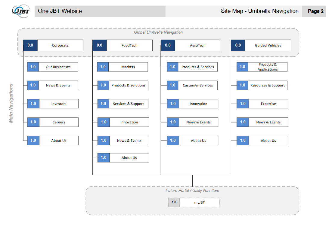
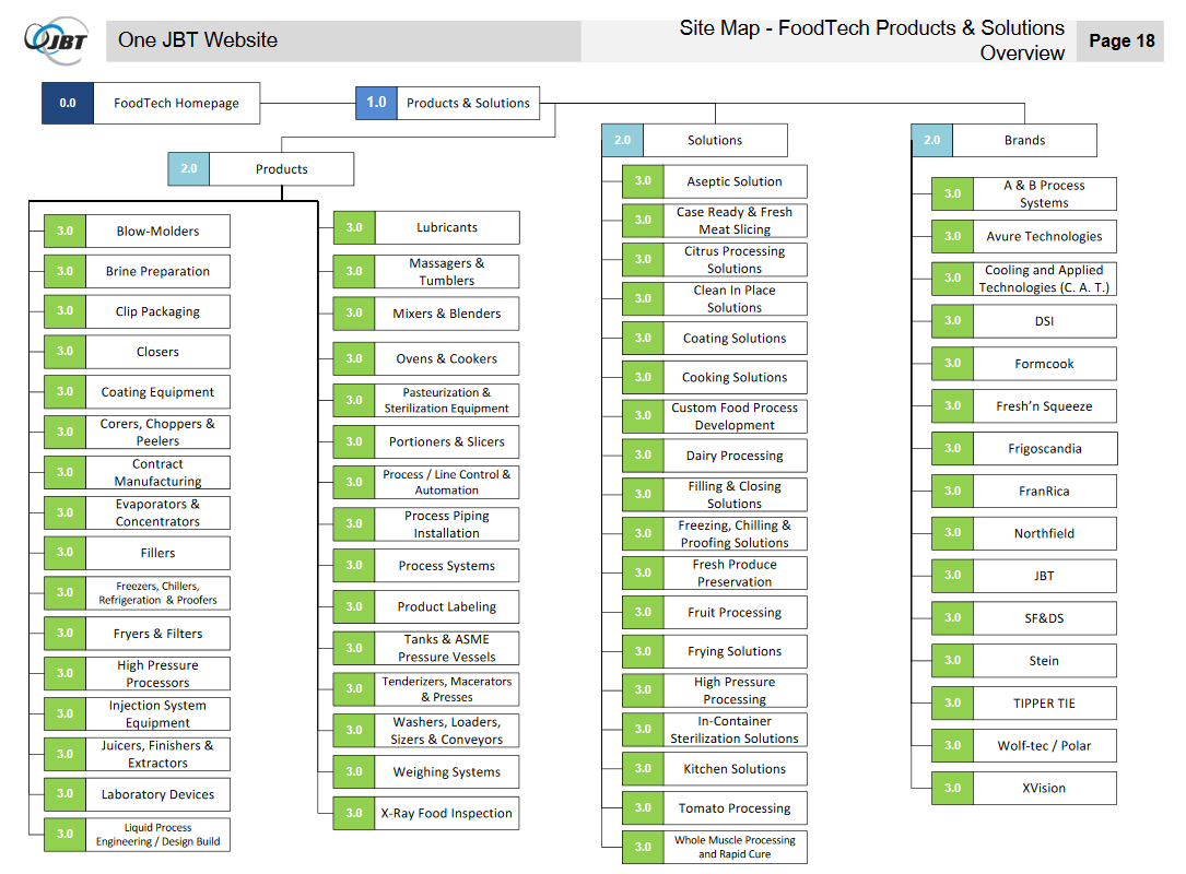
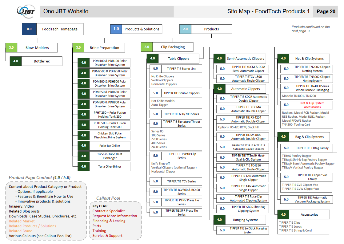
Combining three disparate companies with thousands of products and custom solutions into a single website with a cohesive structure was no easy task. In fact, it resulted in a comprehensive 73-page information architecture document that defined the overarching structure and categorized hundreds of products into logical groupings.
Tools
Stakeholder Interviews, Visio
Features & Solutions
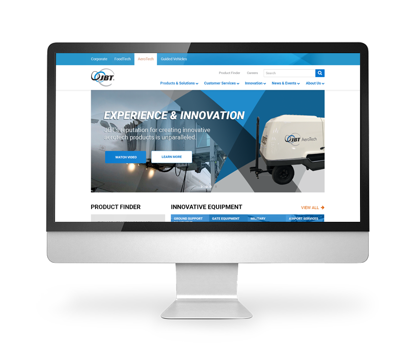
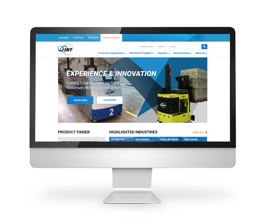
- Introduces the concept of an umbrella navigation so that users can navigate between JBT businesses, but each business can have its own navigation schema
- Allows for navigating down into products via multiple pathways including advanced search, category listings, brand groupings, and solution concepts
- Focuses on innovation and support, two of the main differentiators for JBT as identified by their customers
- Indicates which page types will be required to accommodate all of the implied content
Wireframes
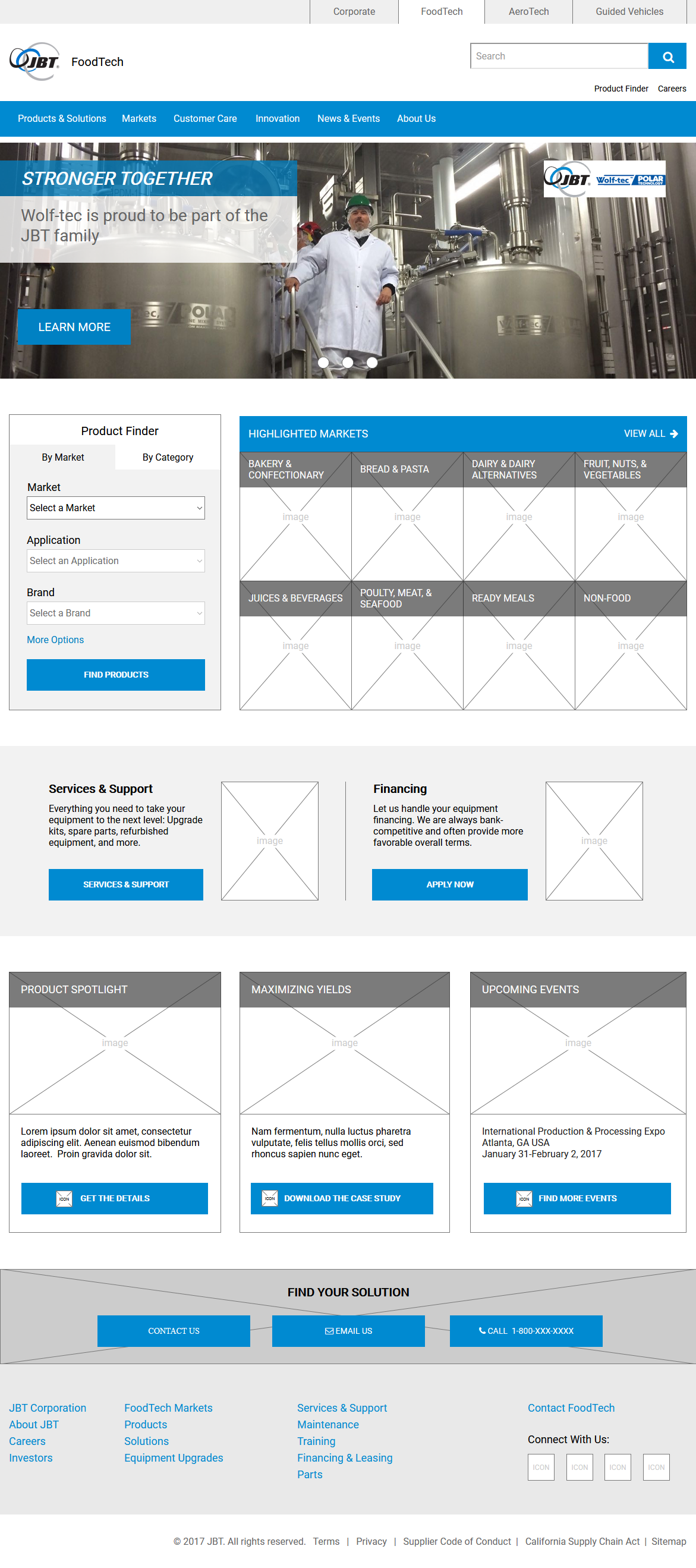
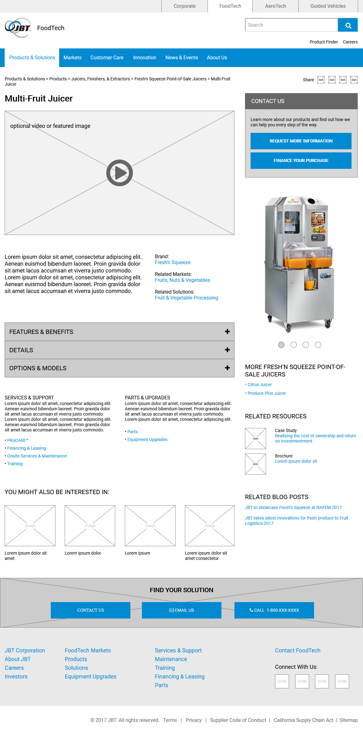
We created wireframes for all identified page types and at all target resolutions. These wireframes were robust enough to be navigable within a browser and user tested.
Tools
Axure Pro
Features & Solutions
- Focuses on offering tools and functionality for finding products and solutions through searching, category structures, representative markets, and more
- Provides similar layouts and components between divisions so that the user experience won’t be too fractured
- Product details page offers cross-selling opportunities, related resources, related markets, and related blog posts
- Persistent calls-to-action continually guide users toward the next step in the buying process
Designs
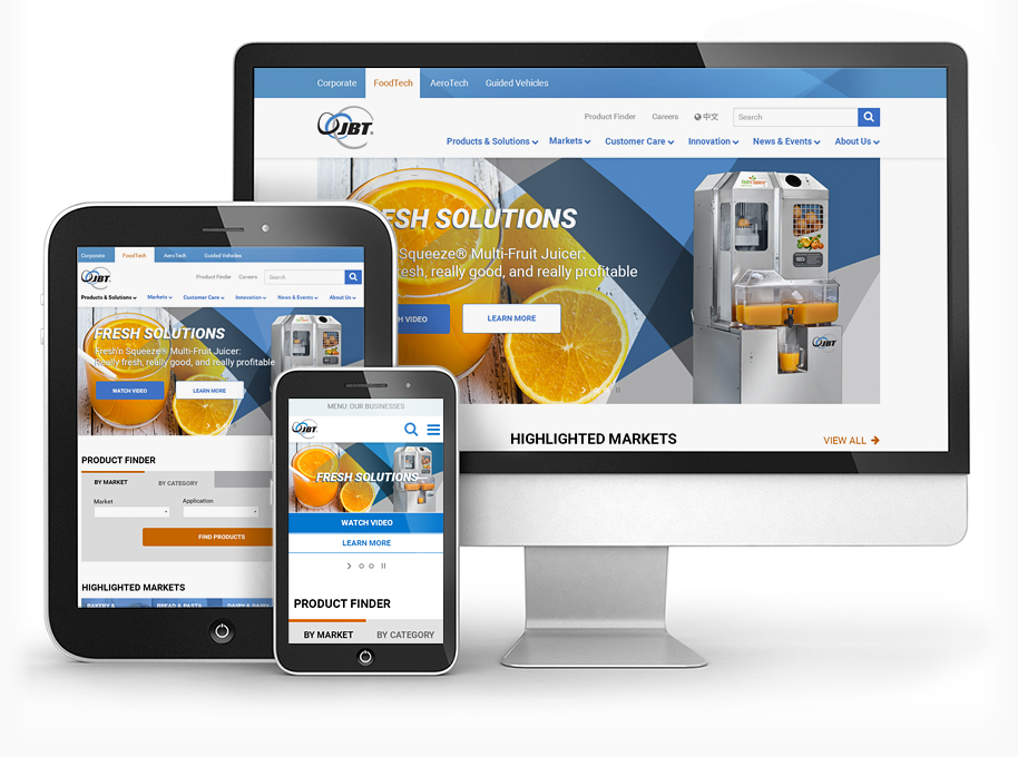
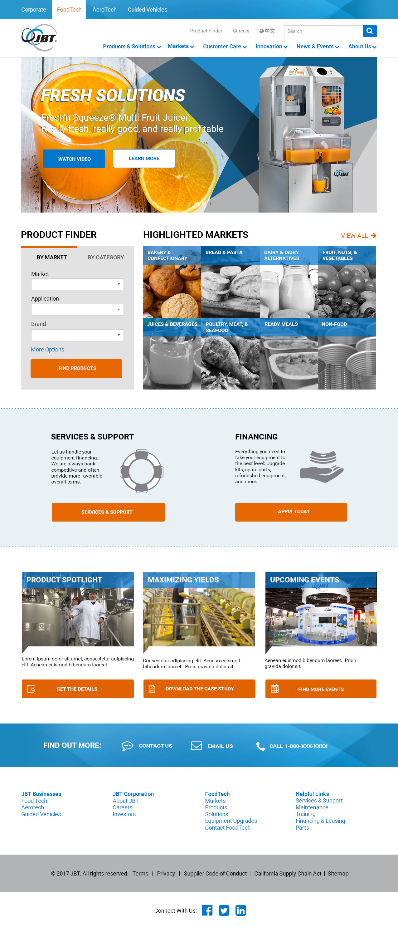
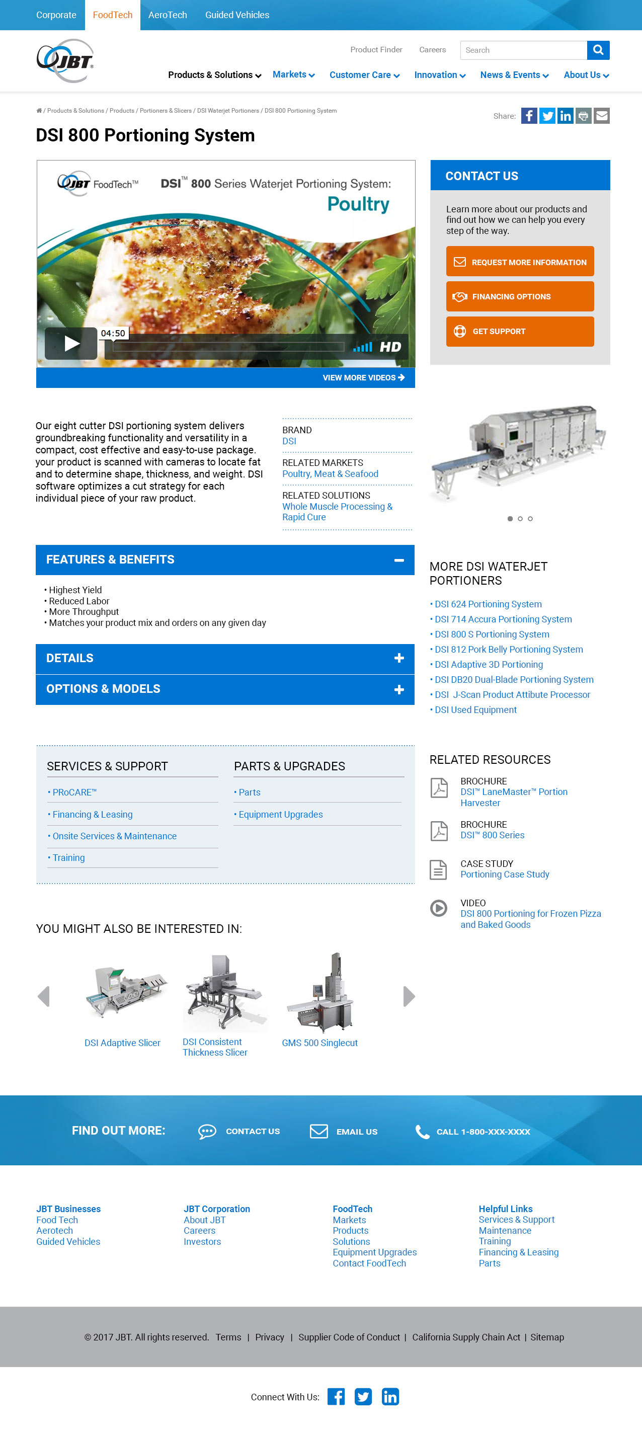
The design phase focused on presenting a solution that was easy for a user to absorb and understand visually, and which elevated the corporation’s brand with a bold color strategy.
Tools
Adobe Photoshop
Features & Solutions
- Simplified layout avoids too much textual content and guides the user’s attention toward multiple avenues for finding products
- Product details page organizes a lot of ancillary information, resources, and data into an easy-to-read format through creative styling and formatting
- The same layout is used effectively across four different websites, all housed under a single umbrella navigation


