The Toro Company
A trusted partnership for over 15 years, resulting in dozens of user experience and design projects, including global frameworks, commercial sites, B2B portals, intranets, corporate sites, and web applications.
Project: myToro.com
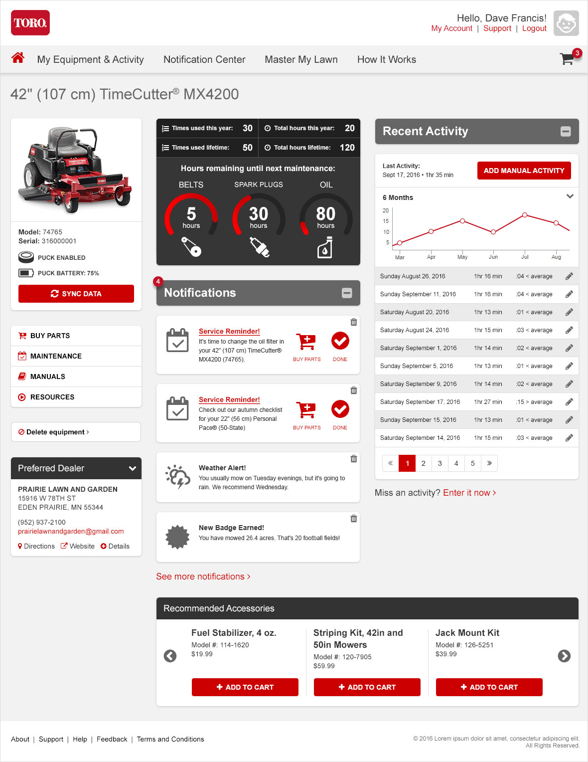
Envisioned as a “fitbit for your mower,” the myToro app connects Toro machinery to the internet-of-things to deliver engaging content and resources, including integrated ecommerce.
Challenges
- Engage the user with data, encourage repeat use
- Drive discreet sales through convenience
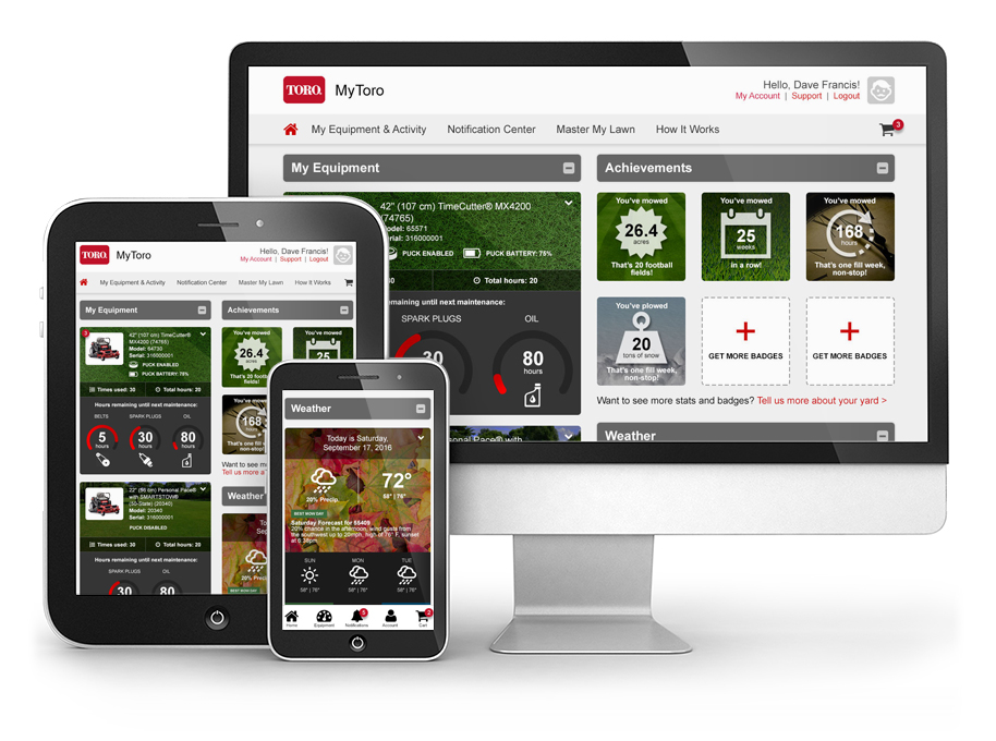
- Work on any device, at any resolution, as both an app and a website
- Integrate with multiple systems, yet present consistent visuals
- Present complex technology as simple and fun
My Role
UX Architect and UX Designer, conducting stakeholder interviews, producing high-fidelity wireframes, UI/Design, and user testing
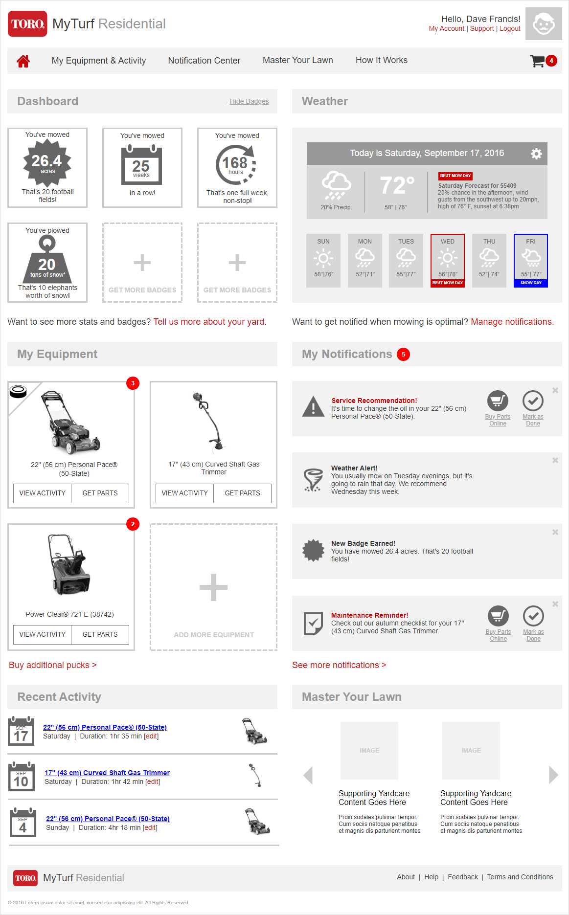
Wireframes
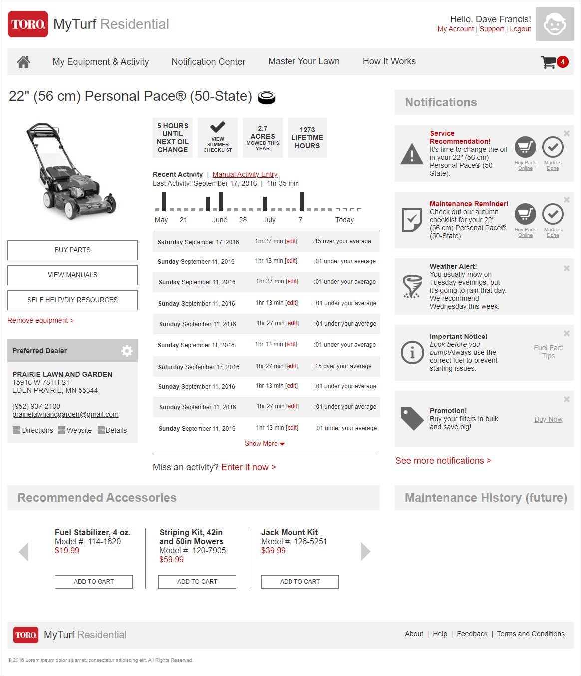
After conducting research and stakeholder interviews to understand the users, goals, and requirements of the project, we developed a set of fully-functional interactive wireframes which were used to validate navigation, define functionality, and test with users. We collaborated with the developers to ensure feasibility and remain within budget.
Tools
Axure Pro
Features & Solutions
- Encourages repeat usage through gamification and earning badges
- Inspires adoption by aggregating statistics, e.g. how fast you mowed this week versus last
- Discreetly offers convenient purchase options tied to service recommendations and accessories
- Integrates with weather services, resource libraries, and location services
- Presents a lot of data and information in a clean, easy-to-scan format
Designs
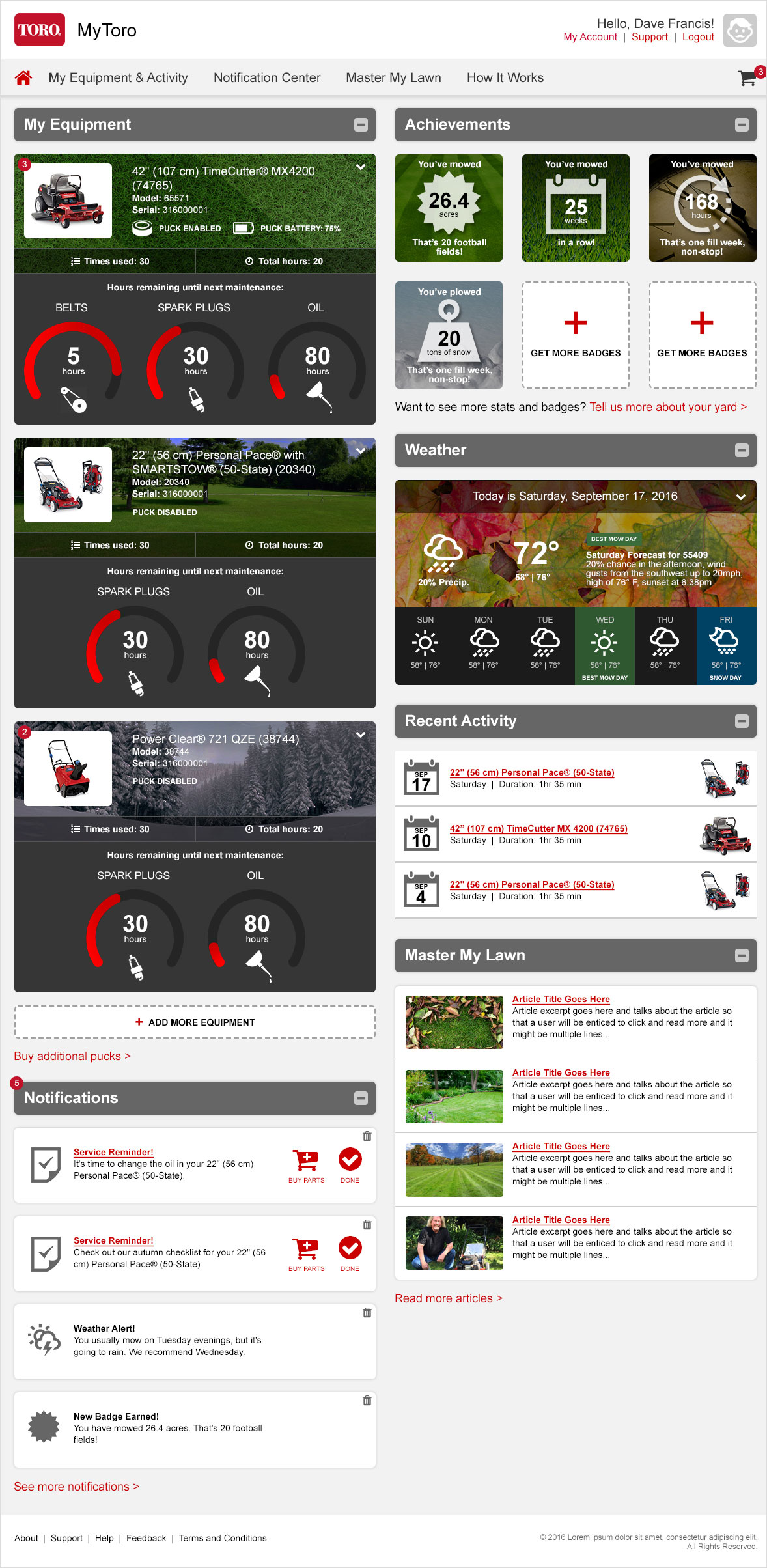
After the wireframes were fully tested and the requirements defined, we moved into the design phase, applying Toro’s defined style and brand guidelines along with a consistent iconography and a color strategy to optimize usability. Designs were created in multiple breakpoints to demonstrate the desktop, tablet, mobile, and app views.
Tools
Adobe Photoshop
Features & Solutions
- Introduces useful animation with gauges that fill and number counters
- Presents consistent and helpful iconography
- Adheres to strict brand standards and guidelines
- Displays a lot of information cleanly and clearly
- Remains easy to use and navigate at any resolution, mimics app functionality on mobile


